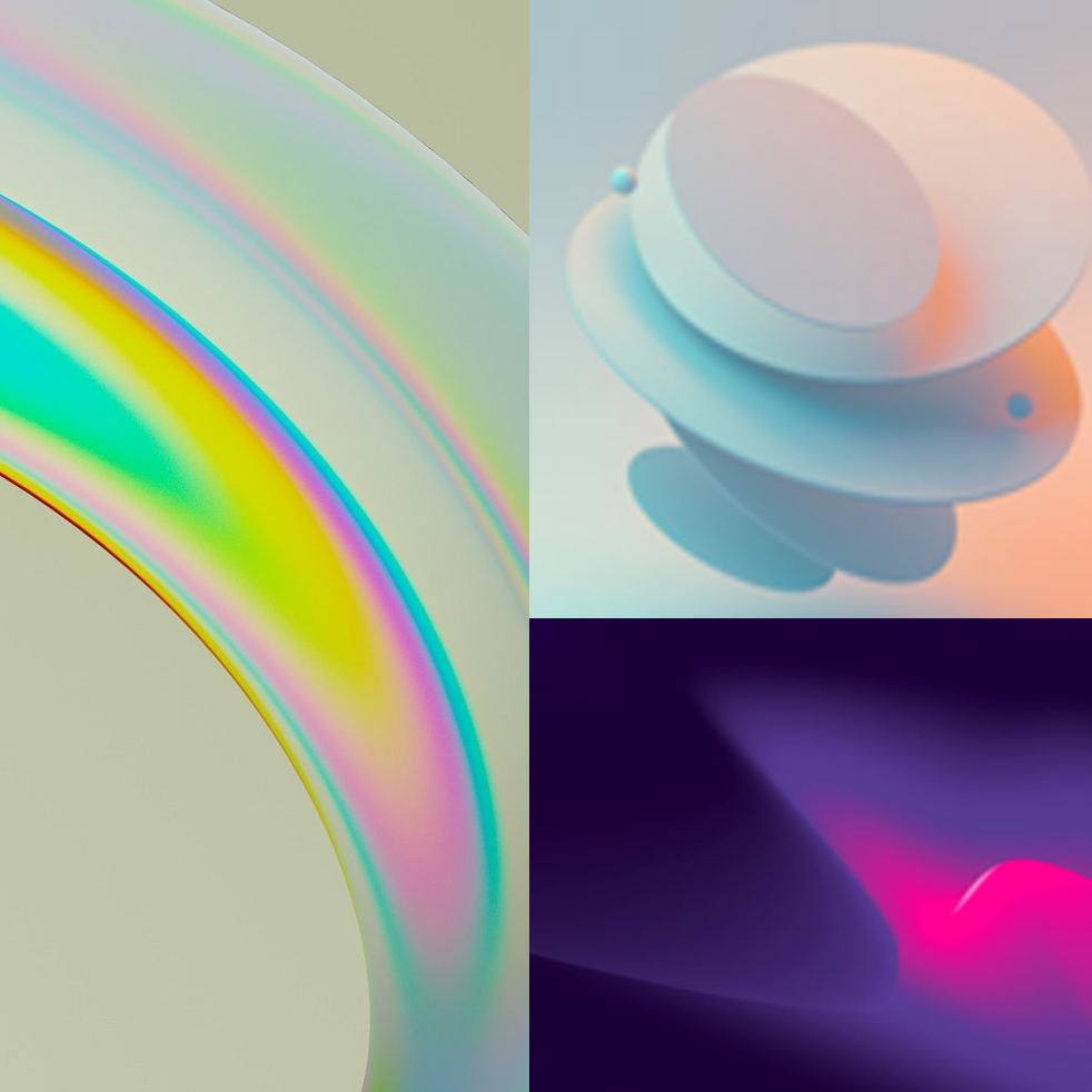
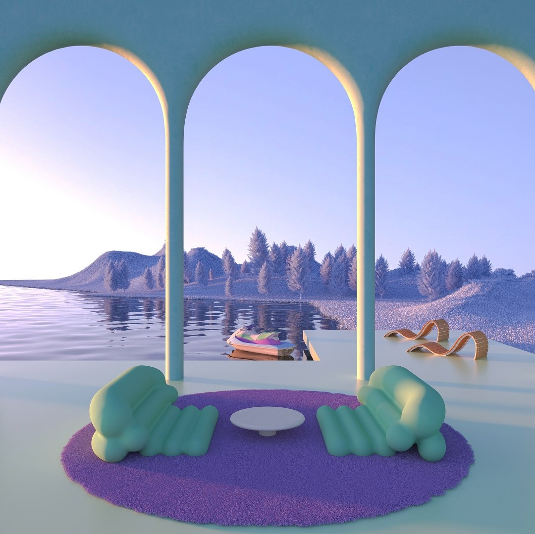
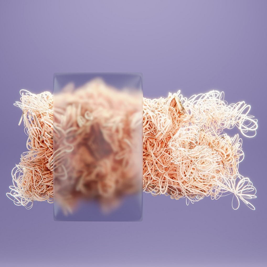
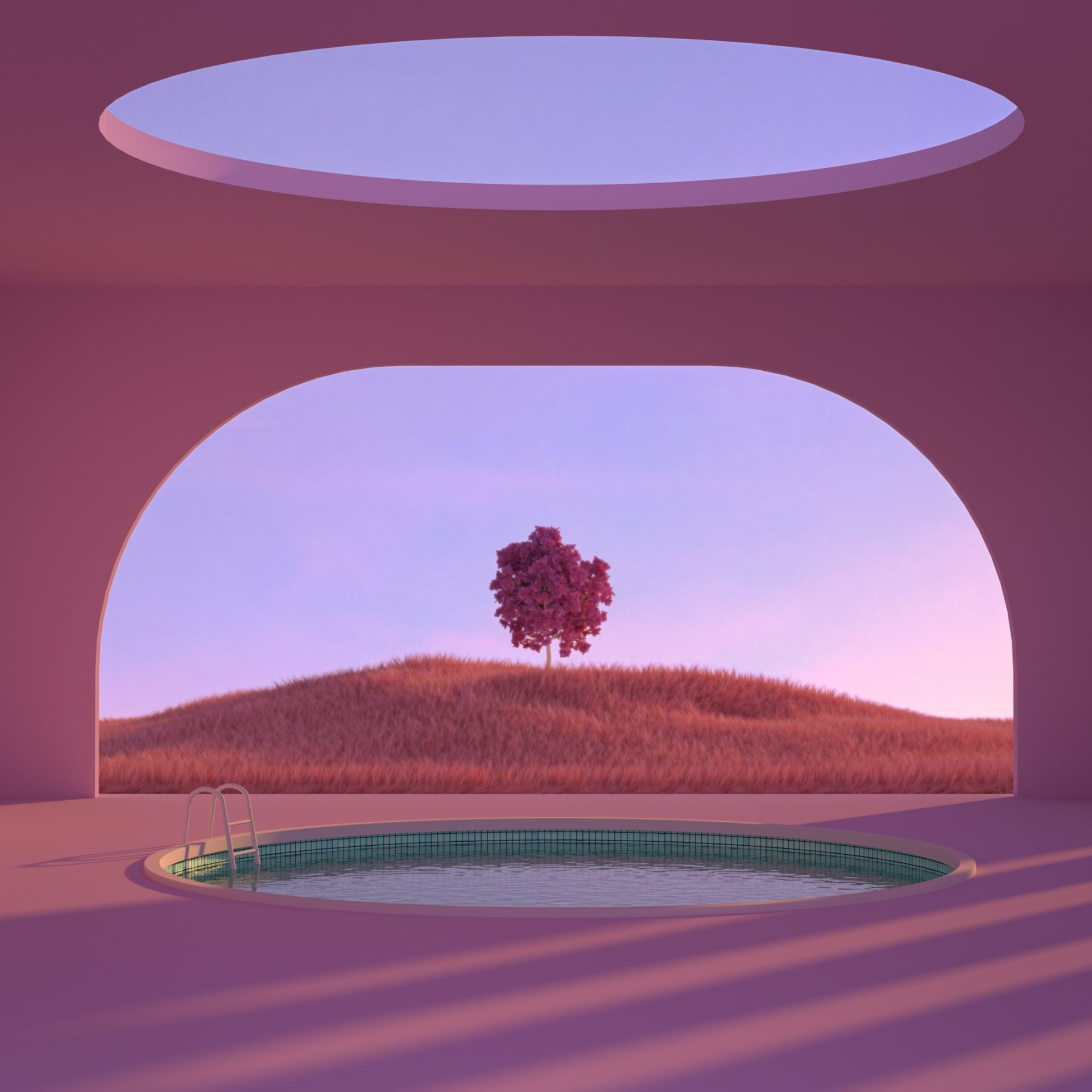
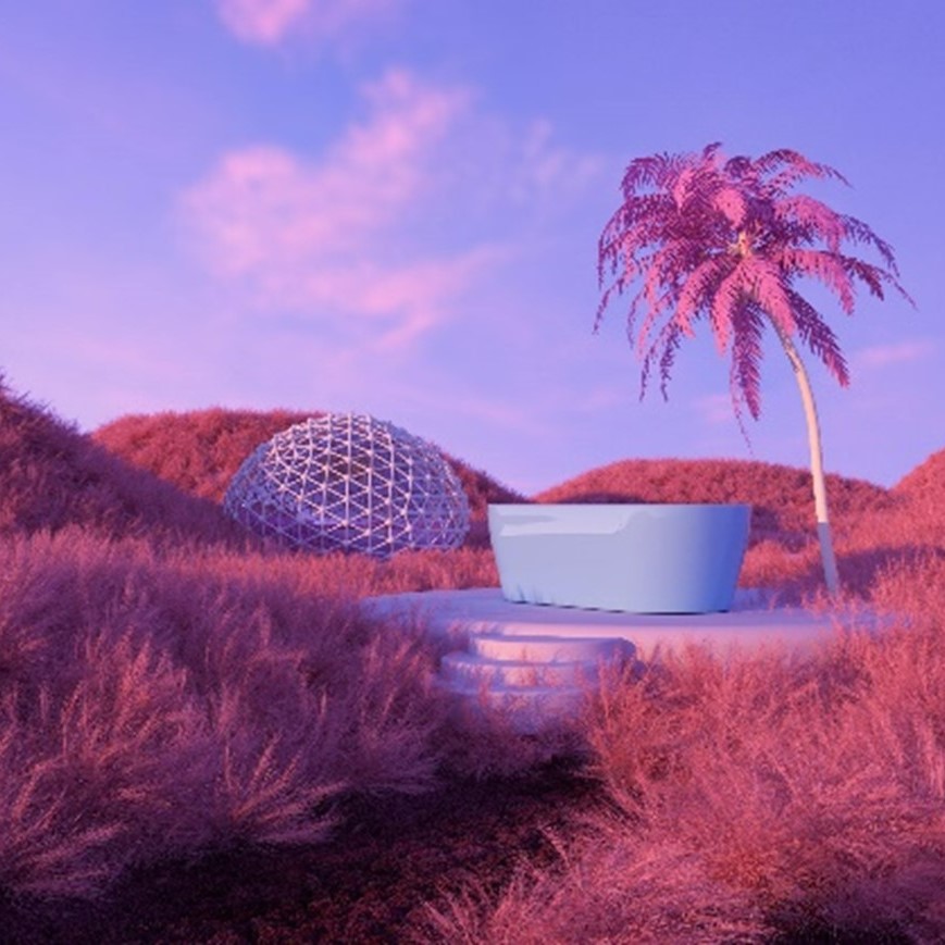
As consumers continue to grapple with ongoing economic, political and environmental crises, a sense of uncertainty about the future will remain a dominant force. WGSN Colour Forecast aligns with influences that will drive consumers as we head toward 2025, including wellbeing, creativity, the environment and technology – with an impact on metaversal space and surface design.
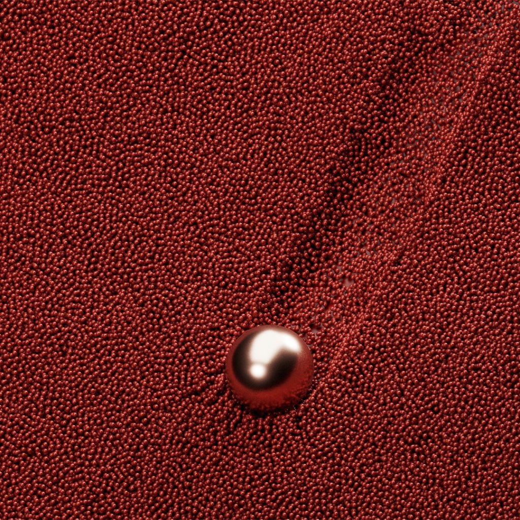
Intense Rust
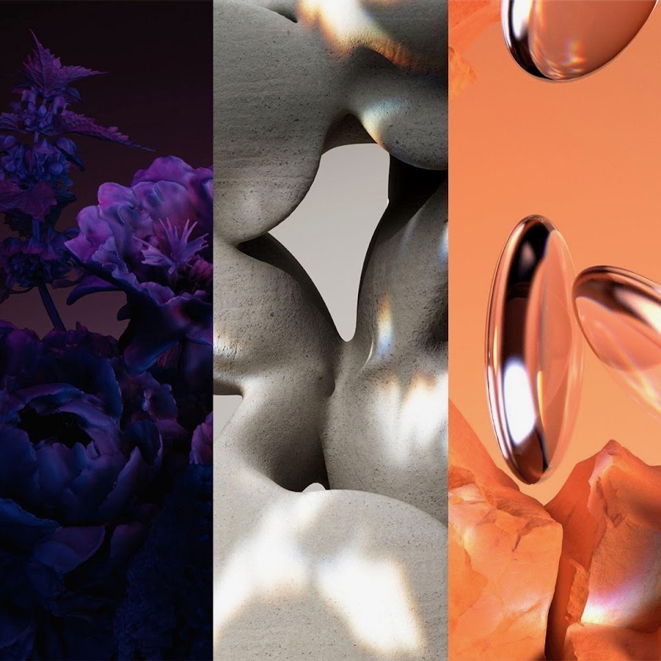
Why it is key: This warm and rich shade is a transseasonal brown that evokes feelings of stability. Balancing luxury with a raw earthy edge, Intense Rust is reminiscent of soil and earth, full of warmth and texture. It’s inspired by consumers increasingly valuing sustainability over newness, communicates authenticity, quiet luxury and promotes the return of classic design – even in digital environments.
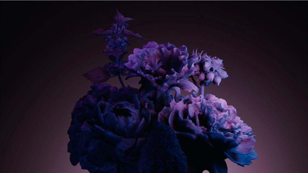
Midnight Plum
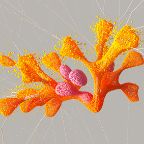
Why it is key: Midnight Plum is a powerful dark purple that connects to themes of space exploration and the metaverse. Images from NASA’s James Webb Telescope are opening up the possibility of unravelling mysteries about the origins of the universe, allowing colours in outer space to capture our imaginations. A tinted hue close to black, this colour celebrates darkness, connecting to a sense of mystery, as well as gothic and underground sentiments. It aligns with the increasing consumer desire for escapism.
Sustained Grey
Why it is key: Sustained Grey confirms the continuing importance of neutrals and more soothing colour choices, which celebrate the pursuit of ‘just enough’. Representing practicality and reliability, this colour is foundational and grounding, with a utilitarian edge. As a timeless shade with transseasonal and long-term appeal, it promotes the virtues of balance and slowing down.

Apricot Crush
Why it is: key:Apricot Crush is WGSN’s Colour of the Year for 2024, reflecting a growing focus on holistic lifestyles that nourish the body and mind. This balancing bright is an activating vitamin-inspired tone that embodies a full-spectrum approach to health and wellbeing. It calls to mind the antioxidant-rich benefits of apricots and oranges, as well as the beauty found in nature. In a period of uncertainty, Apricot Crush will remain especially important as a colour of hope and positivity.

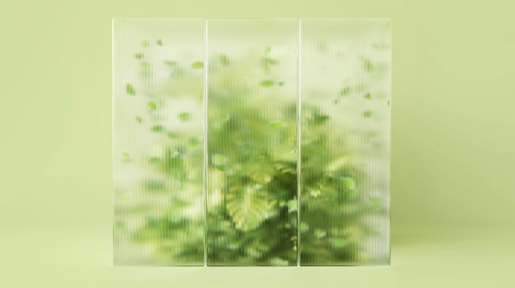
Cool Matcha
Why it is key: Cool Matcha is a tinted pastel with a soothing and calming quality. Connecting to both nature and technology, it highlights the importance of developments in nature-powered bio- and plant-based materials, dyes, pigments and energy sources. As consumers continue to deal with higher levels of anxiety and stress, colours that soothe the mind and bring a sense of rest and reflection will be more appealing. Cool Matcha is a quiet, pacifying pale with a therapeutic quality, and it is the perfect combination of a vegetal green and mindful pastel.
Article powered by WGSN.com
Co-created by
-

WGSN
WGSN
WGSN Is The World's Leading Consumer Trend Forecaster. Our Accurate Forecasts Provide Global Trend Insights, Expertly Curated Data And Industry Expertise To Help Our Clients Understand Consumer Behaviour And Lifestyles, Create Products With Confidence And Trade At The Right Time.
Share
Discussion
Index
Index
Archives
Recommend
Recommend
Recommend
Recommend
Recommend
-

{ Special }
Creation Evolution Tree Library
Creation Evolution Tree Library
Creation Evolution Tree Library
-

{ Special }
A Mirror World of Asynchronous Space & Time
A Mirror World of Asynchronous Space & Time
A Mirror World of Asynchronous Space & Time
-

{ Community }
Is field recording in VR possible?Eisuke Yanagisawa speaks about the act of listening, sound information volume, and technology
Is field recording in VR possible?Eisuke Yanagisawa speaks about the act of listening, sound information volume, and technology
Is field recording in VR possible?Eisuke Yanagisawa speaks about the act of listening, sound information volume, and technology
-

{ Special }
Try Being Born in 1942
Try Being Born in 1942
Try Being Born in 1942
Special
Special
Special
Special
Special
Featured articles spun from unique perspectives.
What Is
“mirror world”...
What Is
“mirror world”...
What Is
“mirror world”...
What Is
“mirror world”...
What Is
“mirror world”...
“mirror world”... What Is
“mirror world”... What Is
“mirror world”... What Is
“mirror world”... What Is
“mirror world”...
Go Down
Go Down
Go Down
Go Down
Go Down
The Rabbit
The Rabbit
The Rabbit
The Rabbit
The Rabbit
Hole!
Hole!
Hole!
Hole!
Hole!
Welcome To Wonderland! Would You Like To Participate In PROJECT GEMINI?

